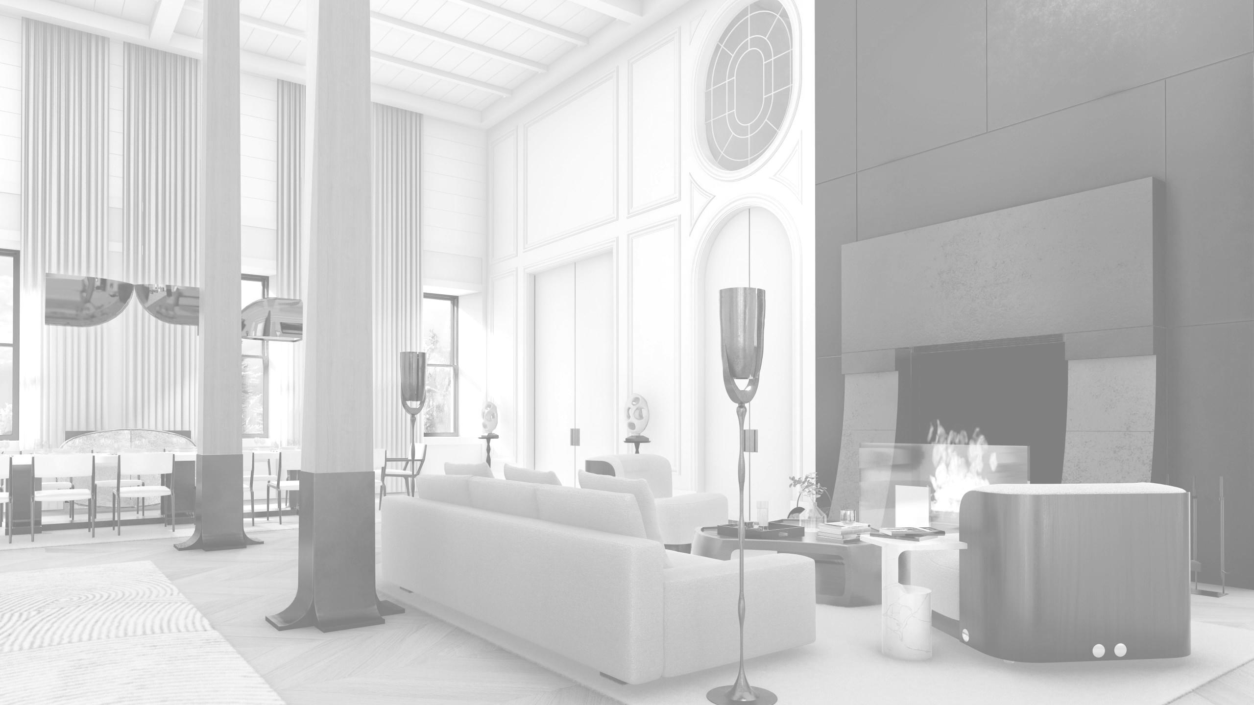
Option #1: Right Image enlarged when clicked
Margaret, the idea here is to show the 2 images side by side. A short description below can be placed to identify the work done.
The BEFORE image in black and white as it relates to a PAST event.
The AFTER image in color and also clickable so it gets large (only on desktop computers as Mobile devices has already the option to make the picture large with the the use of fingers).
These images I suggest to place below the main featured image, OR, at the end of the page. So it doesn't interrupt the content-layout.
Option #2: Dynamic slider
I know, this is not in the minimalistic style of the site but I wanted to show you what is available out there. This is a great option when you have to exact the same images with a before and after condition. And I see that is not always the case. Anyways, I wanted to include this.
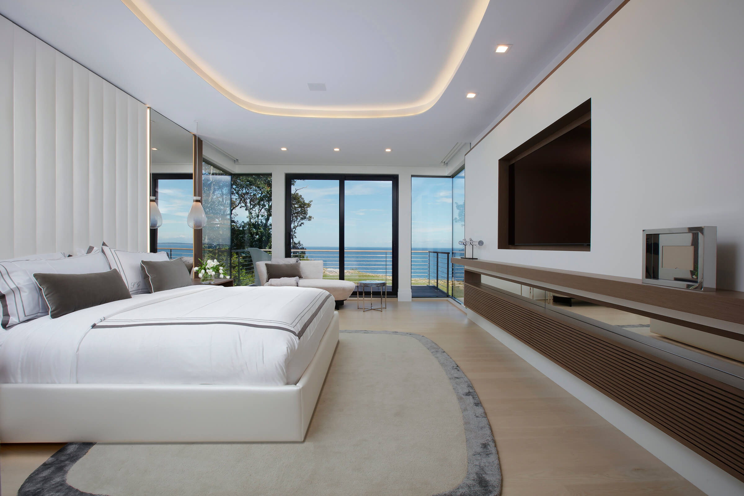
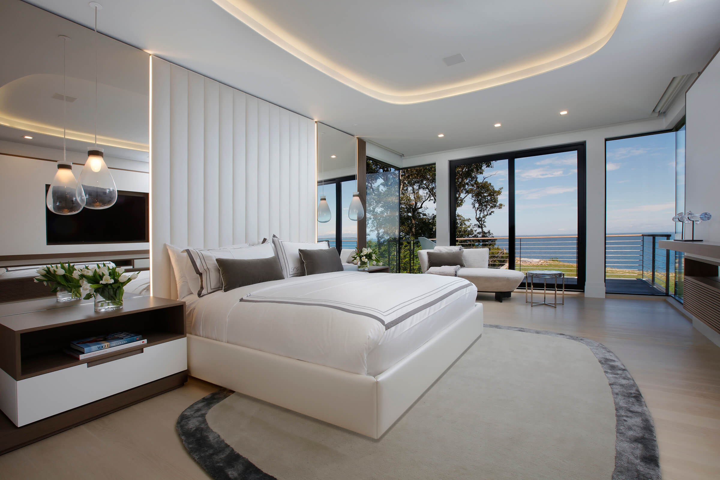
Option #2.1: Dynamic slider
Or, you can use a more descriptive text below the images instead of the white text against black background labels.
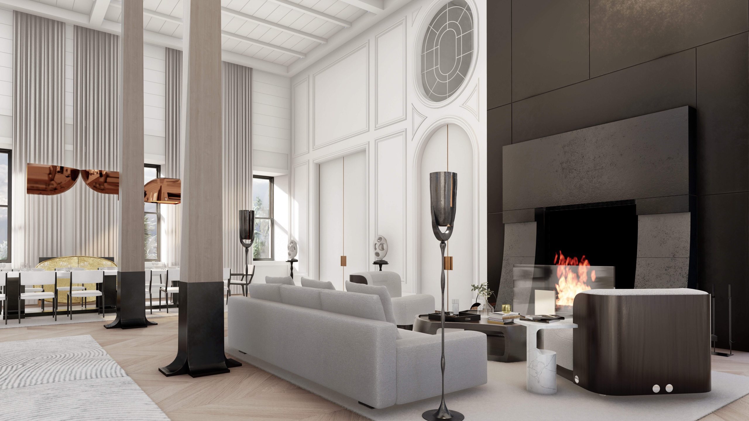
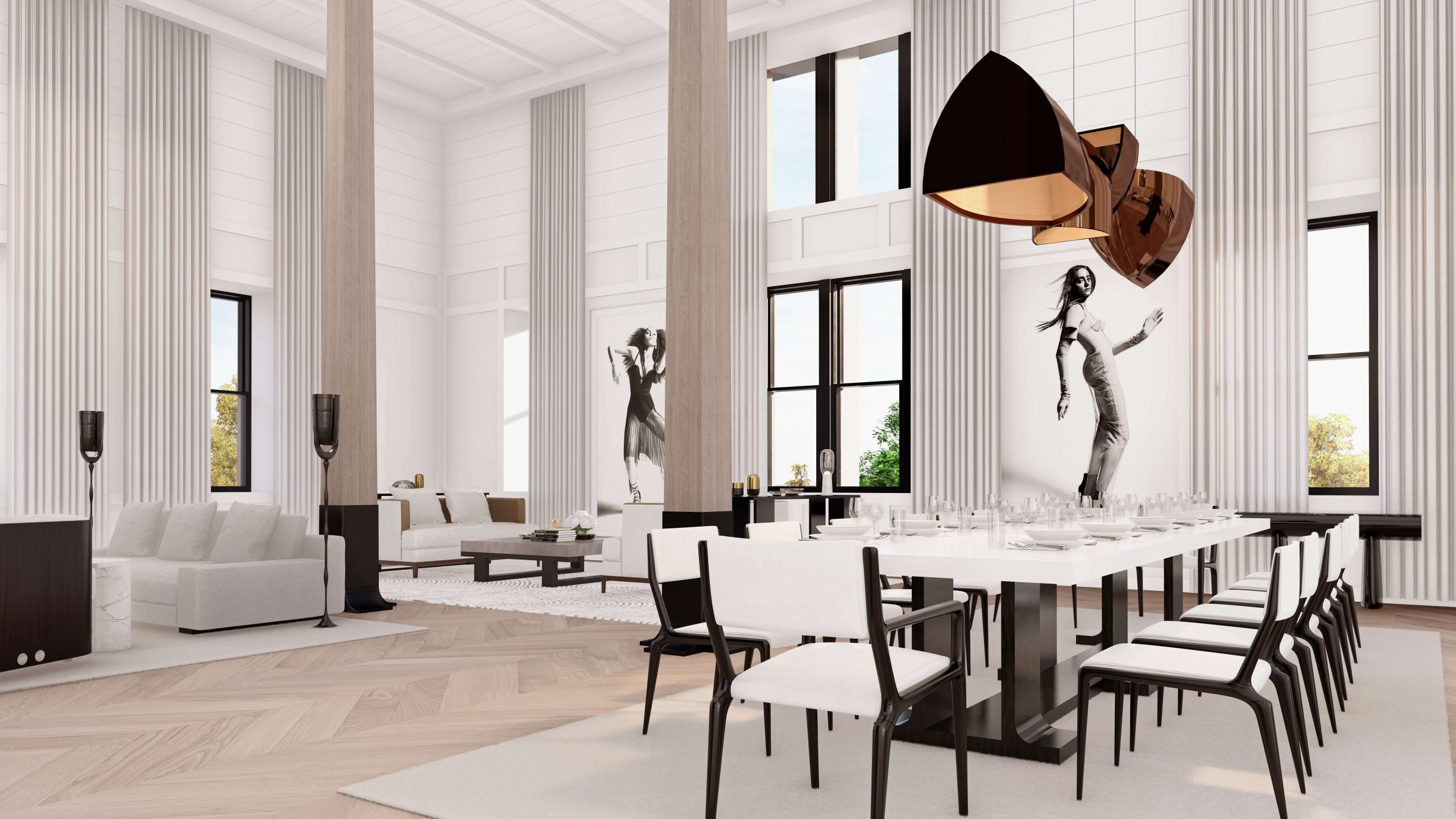
Before: This project began on November 12, 2020 in collaboration with...
After: This project was completed on 01-01-2021. See images below...
Option #3: Two small BEFORE images and a Large AFTER image.
This would be the last option as how to present the BEFORE & AFTER images.
Ok, this is a regular in-progress portfolio I replicated as an example. I have inserted below the featured image the option #3 as an example. I have added a thin lite line at top and bottom so it groups the intended solution.
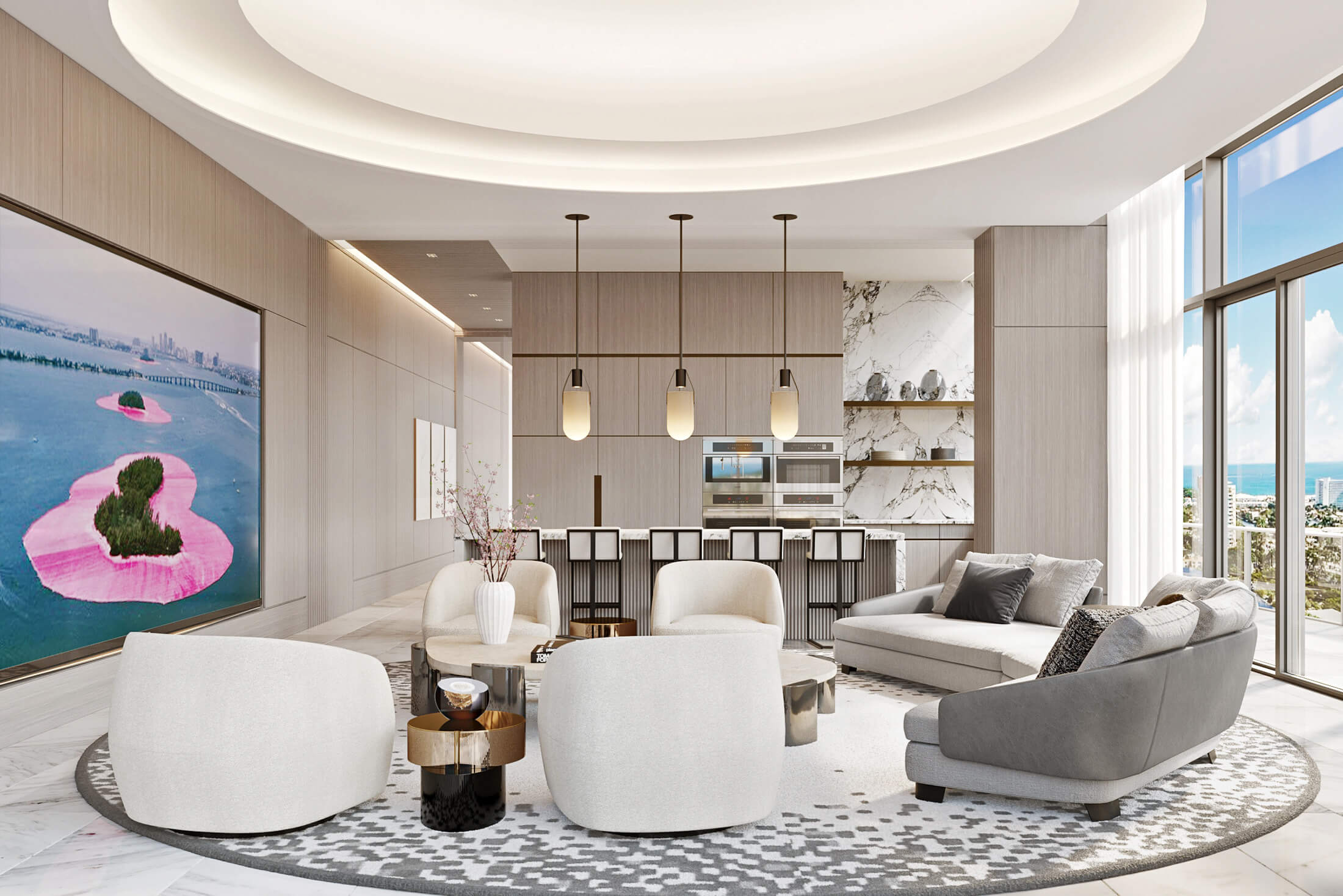
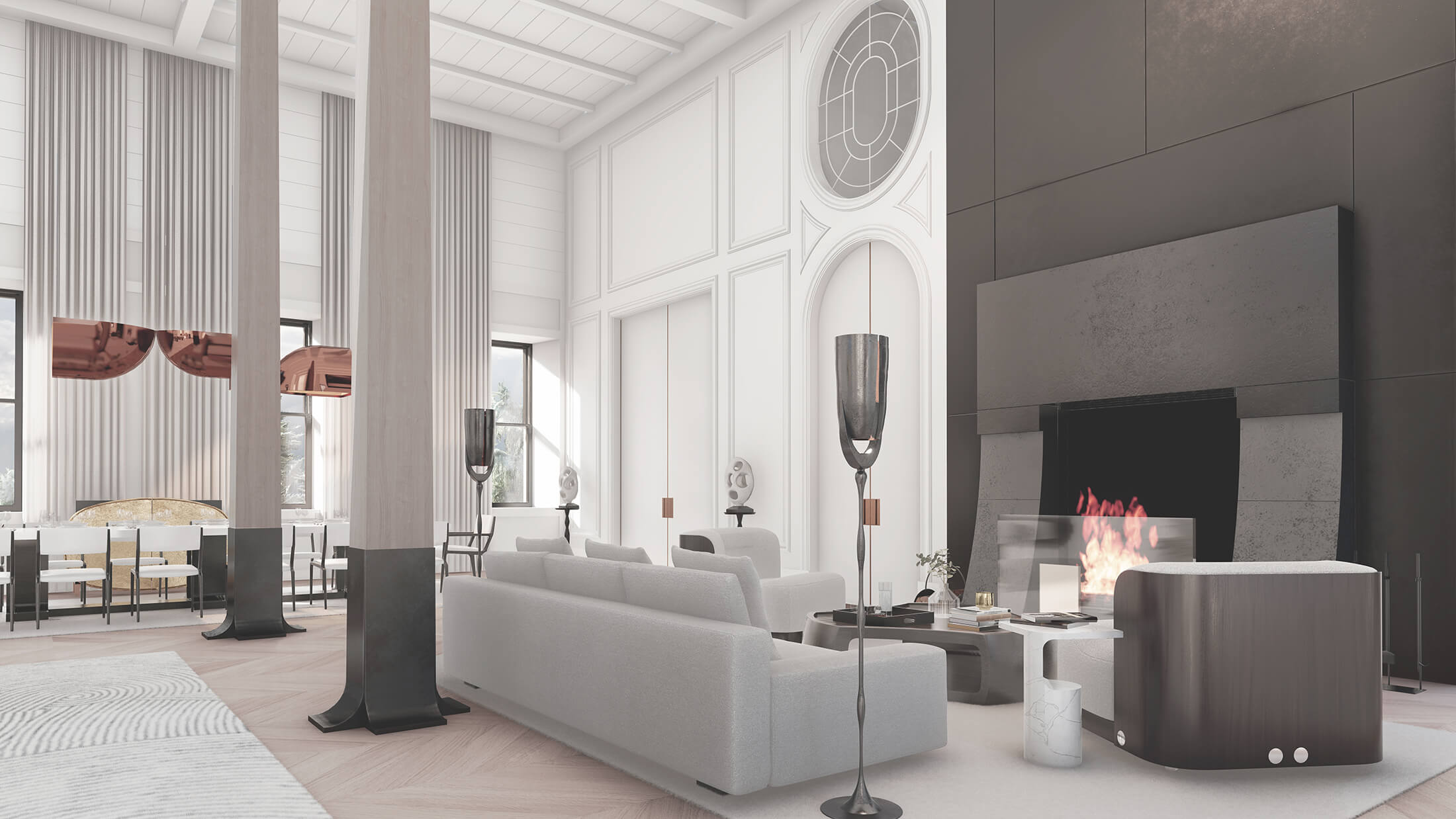
This is the way it would look the BEFORE+AFTER section below the featured image. This is image 1.
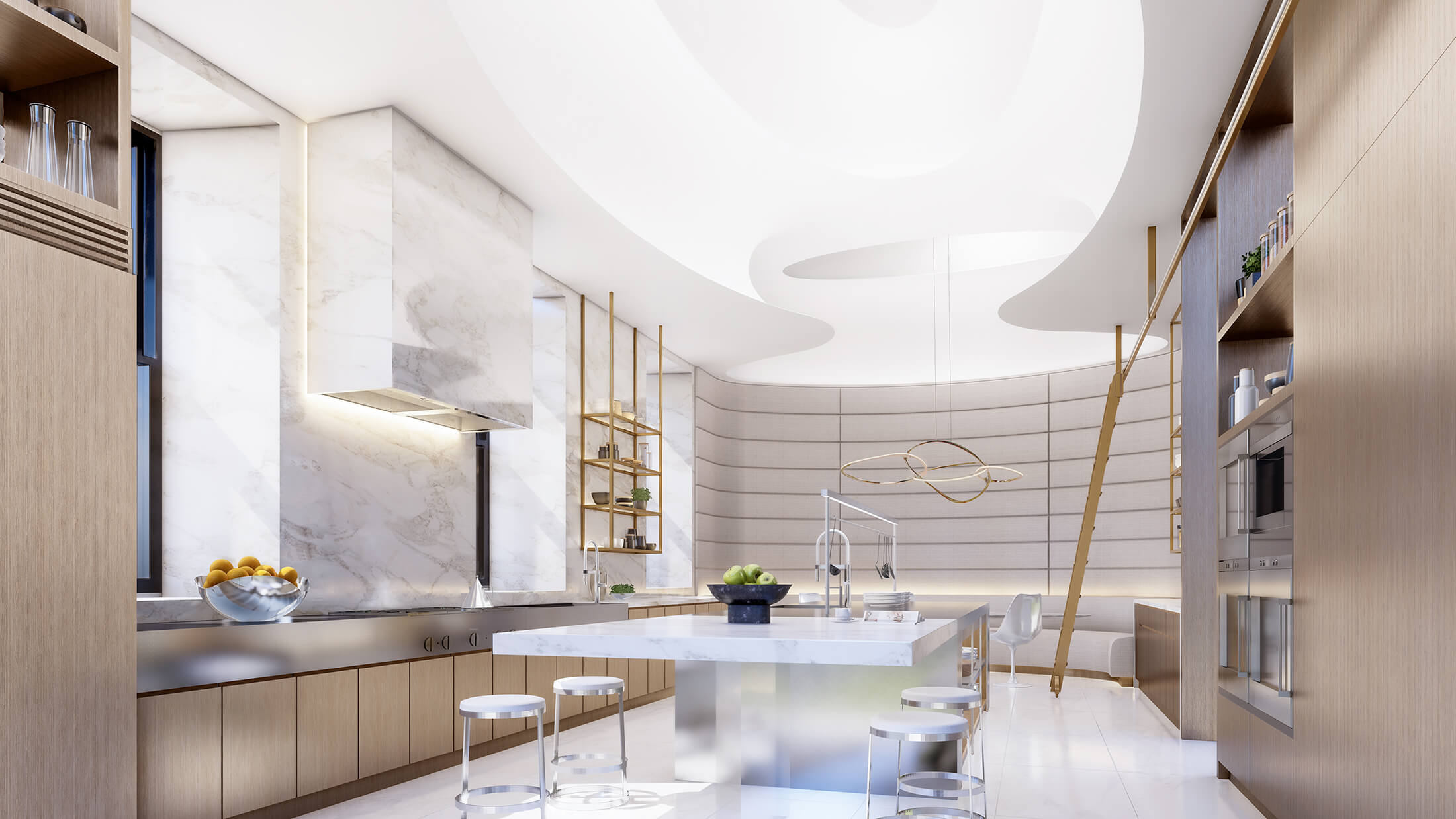
This is the way it would look the BEFORE+AFTER section below the featured image. This is image 2.
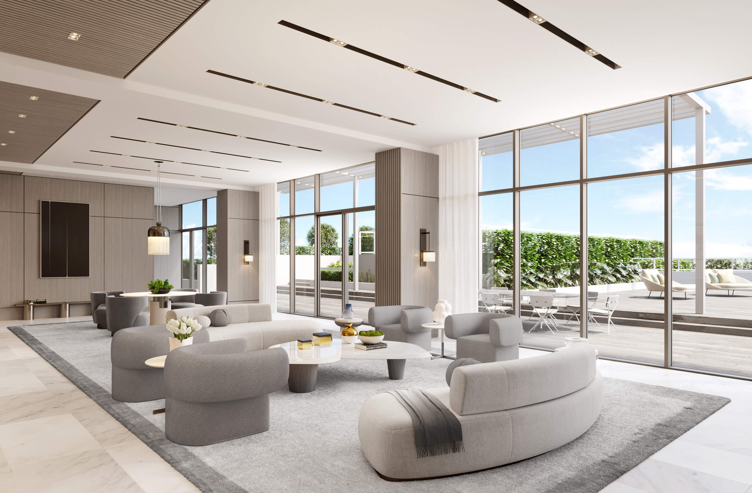
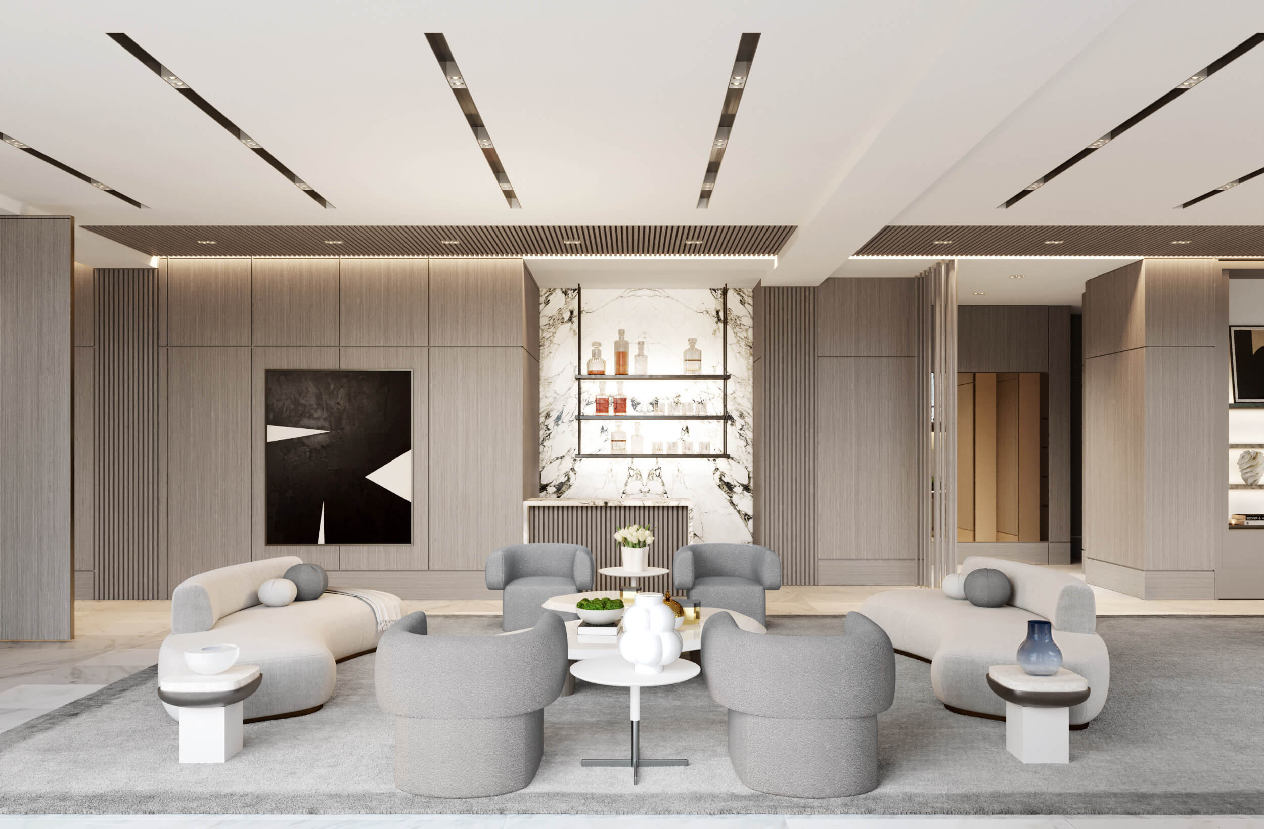
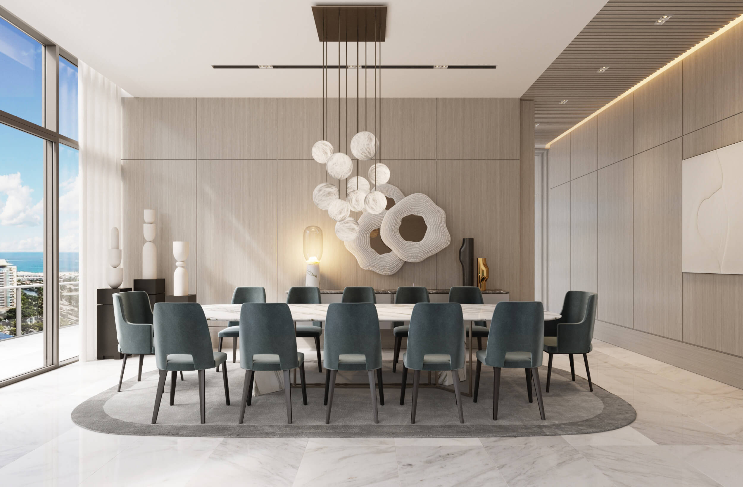
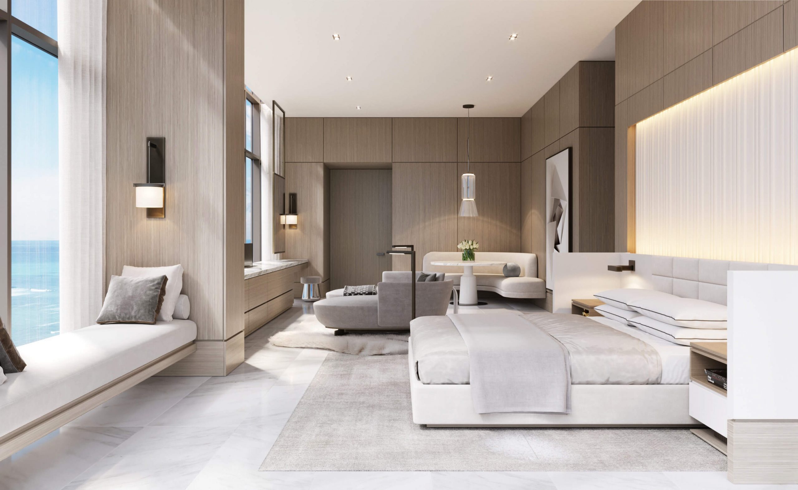
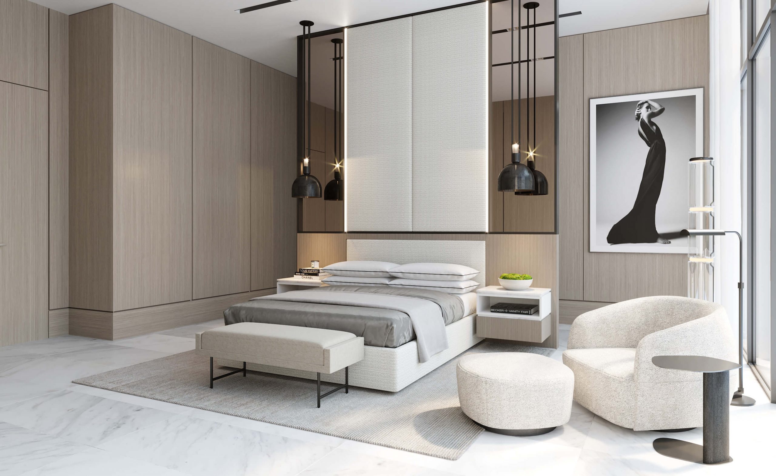
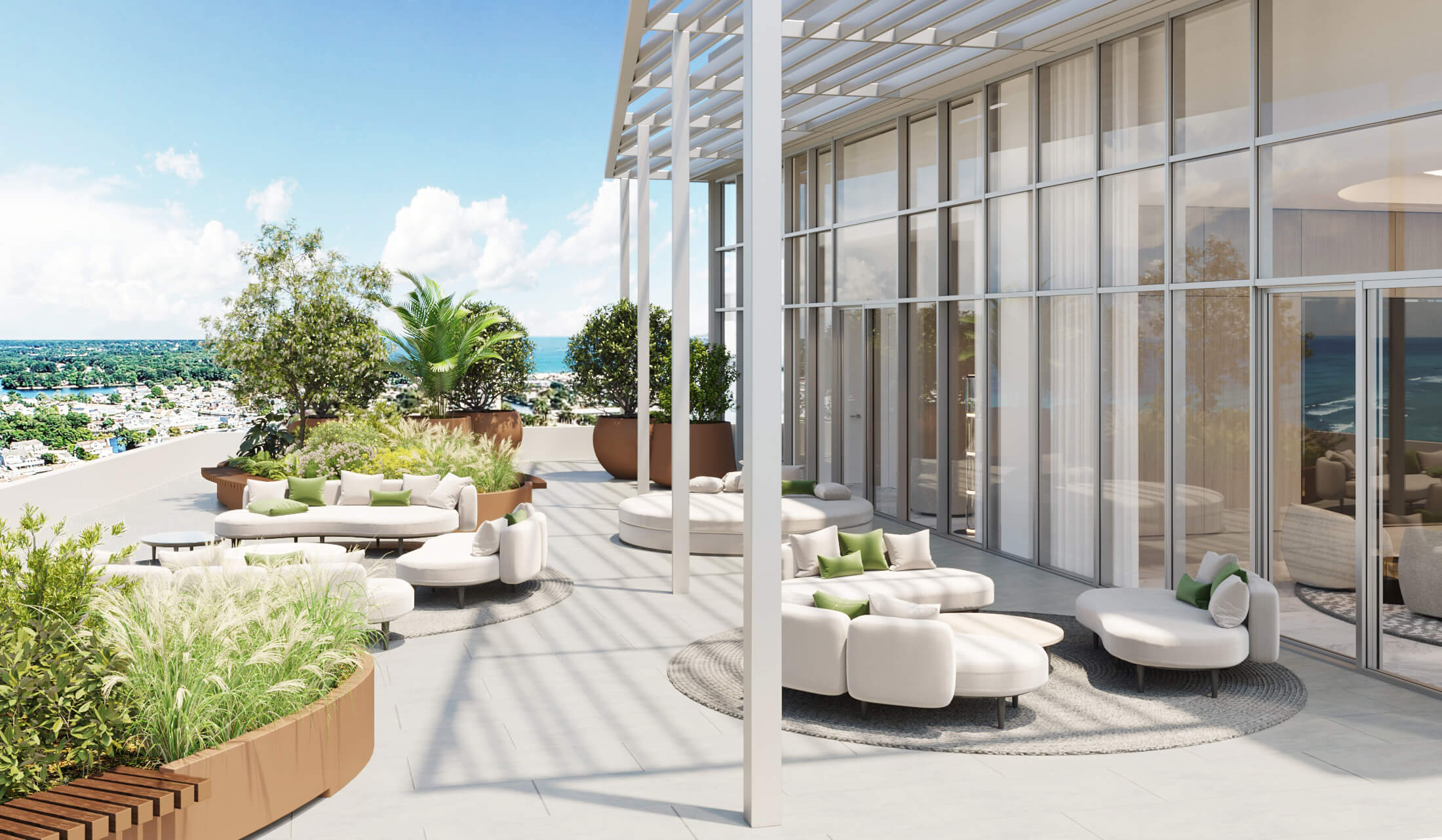
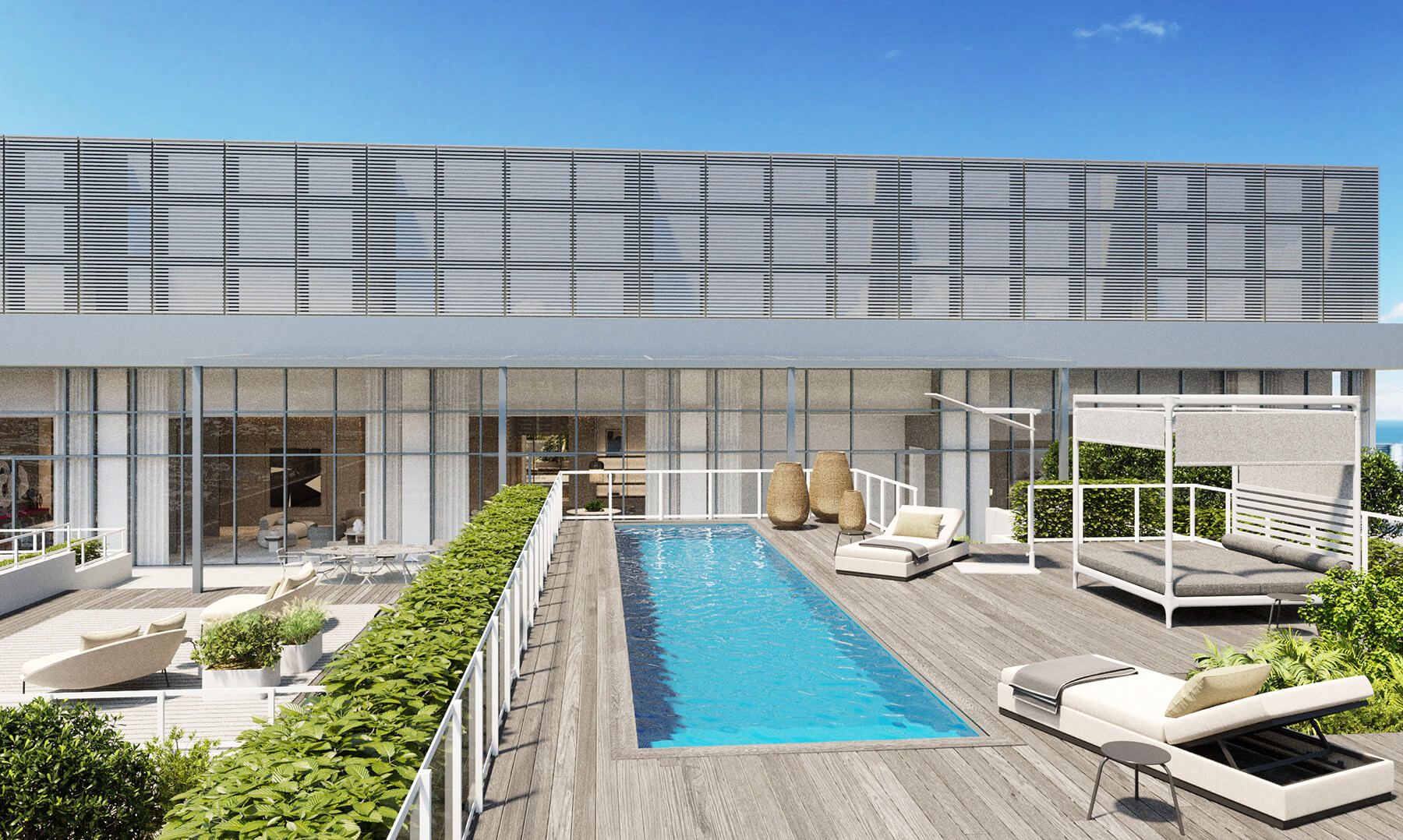
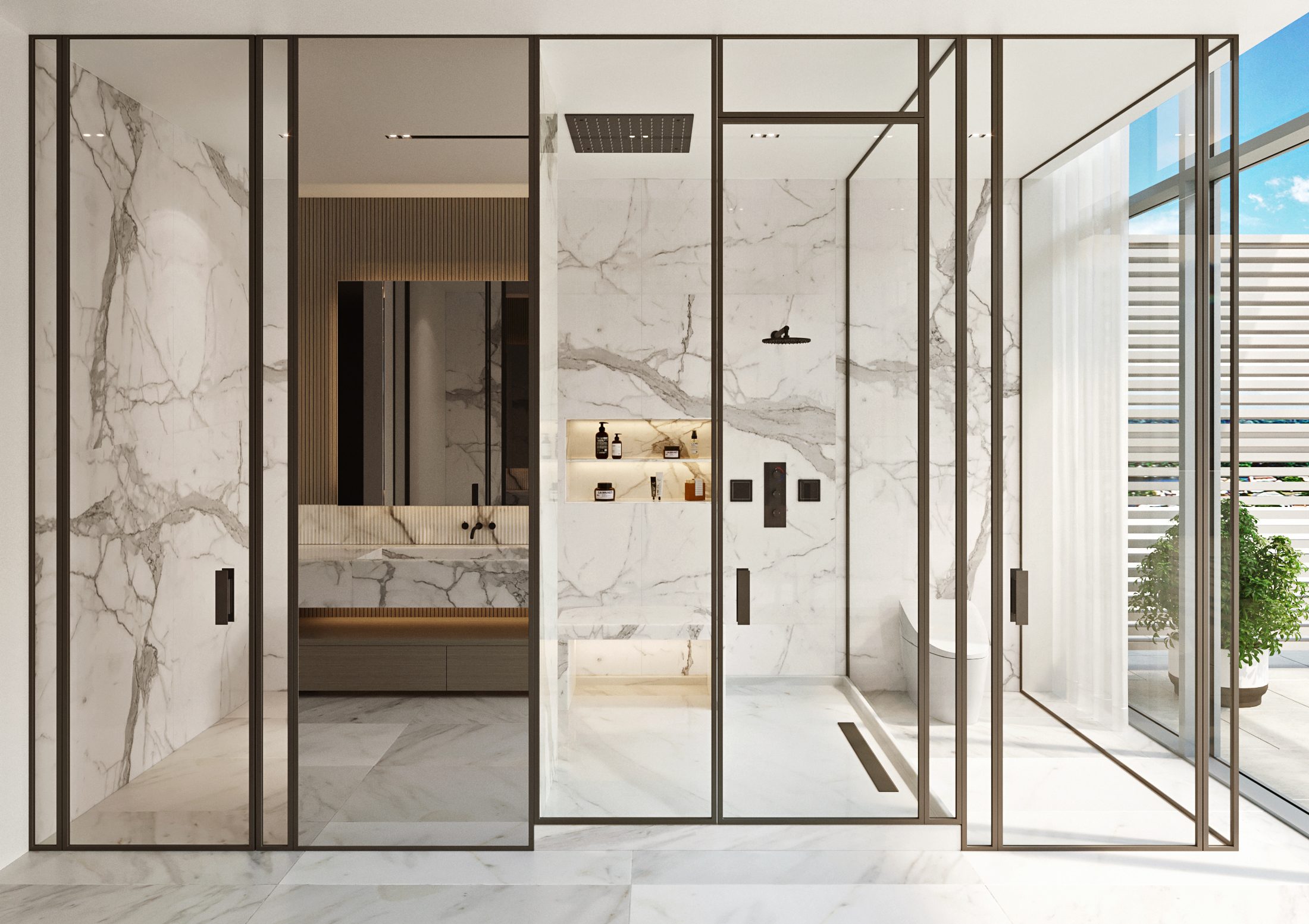
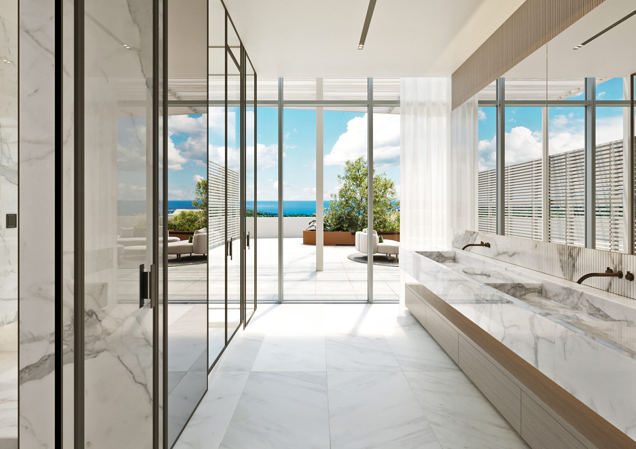
IN-PROGRESS
Ritz-Carlton Miami Beach PH
Our Britto Charette interior design team is thrilled to be designing a penthouse at the award-winning Ritz-Carlton Residences in Miami Beach, Florida.
In collaboration with the Miami architecture firm, Stantec, architect Piero Lissoni has designed an exciting new level of luxury living in Miami. The Ritz-Carlton Residences in Miami Beach boasts 111 condominium residences and 15 single-family villas and promises residents breathtaking views, Italian craftsmanship, and absolutely decadent amenities, including deeded boat slips.
Our clients’ penthouse is comprised of nearly 6,000 sqft of luxury living space and a terrace that provides captivating views. We have created a design for them that is simultaneously modern and elegant, honoring Lissoni’s architectural vision for the adaptive reuse building the penthouse sits atop.

